# plot_ly(loans, x = loans$homeownership)
# plot_ly(loans, x = ~homeownership, type = "histogram")Interactive Visualization 📈
MATH/COSC 3570 Introduction to Data Science
Dr. Cheng-Han Yu
Department of Mathematical and Statistical Sciences
Marquette University
Department of Mathematical and Statistical Sciences
Marquette University
Interactive Visualization
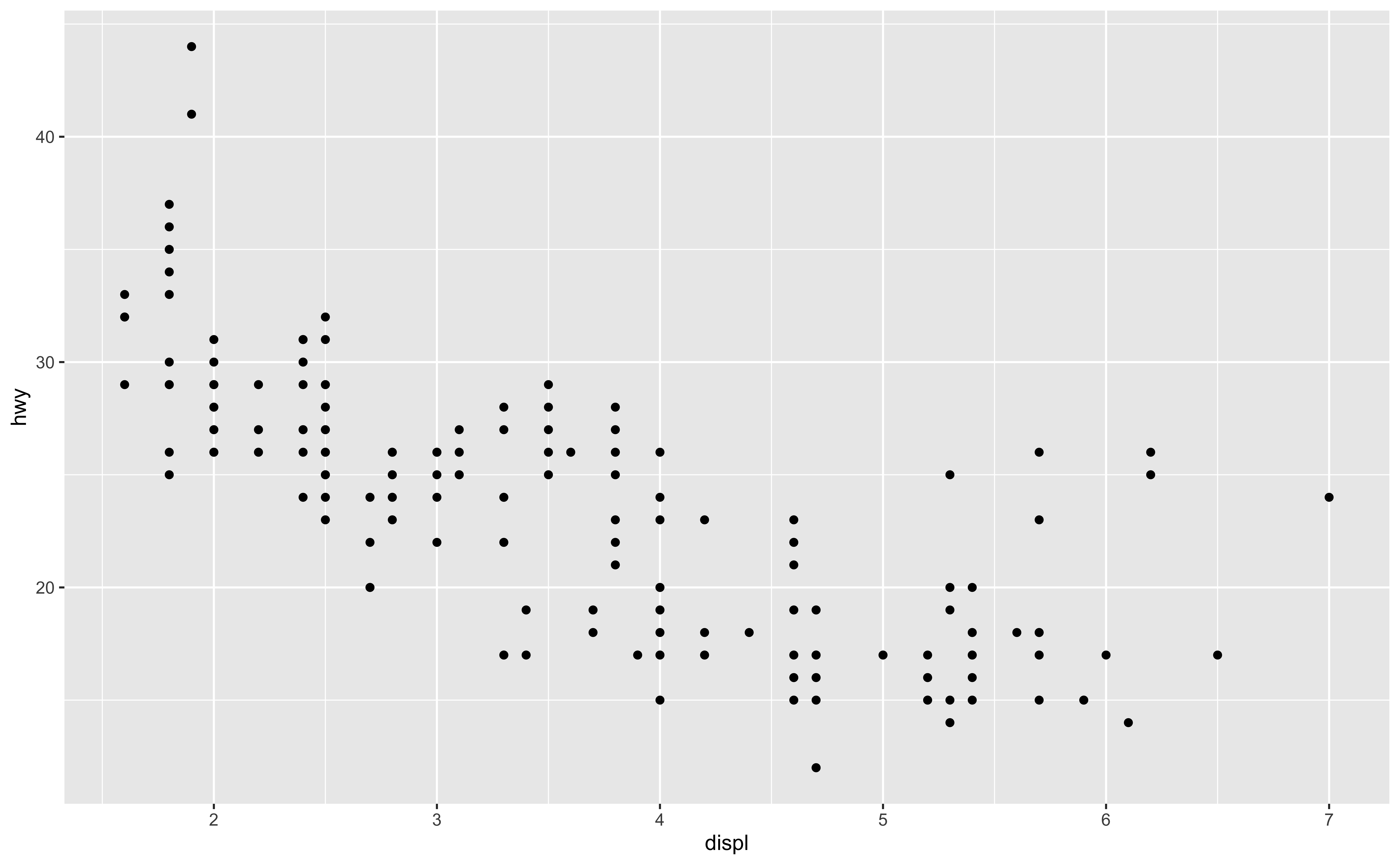
Boring Static ggplot

Informative Inteactive ggplot
Plotly 📦
- To create a plotly object
- directly initializing a plotly object with
plot_ly(),plot_geo(), etc. - transforming a ggplot2 object via
ggplotly()into a plotly object
- directly initializing a plotly object with
- Both are powered by the JavaScript graphing library plotly.js, so many of the same concepts and tools for one interface can be reused in the other.

plot_ly()
- Mapping homeownership to x yields a bar chart
plot_ly()
plot_ly()
- Mapping homeownership & grade to x & y yields a heatmap
loans |> plot_ly(x = ~homeownership, y = ~grade)# plot_ly(loans, x = ~homeownership, y = ~grade, type = "histogram2d")plot_ly()
- Mapping homeownership & grade to x & color yields a dodged bar chart
loans |> plot_ly(x = ~homeownership, color = ~grade)# plot_ly(loans, x = ~homeownership, color = ~grade, type = "histogram")layout()
The 1st argument is a plotly object.
Other arguments include
legend,margins,size, etc.
plotly::layout(p = plot_ly(loans, x = ~homeownership),
title = "My beatiful bar chart")add_*() Functions
Define how to render data into geometric objects,
add_contour(),add_boxplot(), etc.add_markers()for scatterplots.
# plot_ly(mpg, x = ~cty, y = ~hwy, type = "scatter", mode = "markers", alpha = 0.5)
base_plot <- mpg |> plot_ly(x = ~cty, y = ~hwy)
base_plot |> add_markers(alpha = 0.7, size = 2)add_paths()
base_plot |> add_paths()Color
## alpha here is "setting", not "mapping"
p <- mpg |> plot_ly(x = ~cty, y = ~hwy, alpha = 0.7)
p |> add_markers(color = ~factor(cyl), size = 3)Symbols
p |> add_markers(symbol = ~factor(cyl), color = I("red"))add_lines()
ggplotly()
-
plotly::ggplotly()translate ggplot2 to plotly.
p <- loans |>
    ggplot(aes(x = debt_to_income, y = interest_rate)) +
    geom_point(alpha = 0.5) +
    theme_bw()
ggplotly(p)ggplotly()
- Easily compare levels of grade (loan quality) by leveraging the legend filtering capabilities.
14-plotly
In lab.qmd ## Lab 14 section,
Load tidyverse and plotly and the
loans.csvdata.Generate a plot using plotly. An example is shown below. Welcome to create a more fancy one!
Dumbell Chart
mpg |>
    group_by(model) |>
    summarise(c = mean(cty), h = mean(hwy)) |>
    mutate(model = forcats::fct_reorder(model, c)) |>
    plot_ly() |>
    add_segments(x = ~c, y = ~model,
                 xend = ~h, yend = ~model,
                 color = I("gray"), showlegend = FALSE) |>
    add_markers(x = ~c, y = ~model,
                color = I("blue"),
                name = "mpg city") |>
    add_markers(x = ~h, y = ~model,
                color = I("red"),
                name  = "mpg highway") |>
    plotly::layout(xaxis = list(title = "Miles per gallon"))
Maps
pop_den <- datasets::state.x77[, "Population"] / state.x77[, "Area"]

g <- list(scope = 'usa',
          projection = list(type = 'albers usa'),
          lakecolor = toRGB('white'))

plot_geo() |>
    add_trace(z = ~pop_den, text = state.name, span = I(0),
              locations = state.abb, locationmode = 'USA-states') |>
    plotly::layout(geo = g)
3D Scatterplots
mpg |> plot_ly(x = ~cty, y = ~hwy, z = ~cyl) |>
    add_markers(color = ~factor(cyl))
3D Surfaces
Animations using Frames
library(gapminder)
p <- gapminder |> ggplot(aes(gdpPercap, lifeExp, color = continent)) +
  geom_point(aes(size = pop, frame = year, ids = country)) +
  scale_x_log10()

ggplotly(p)Animation
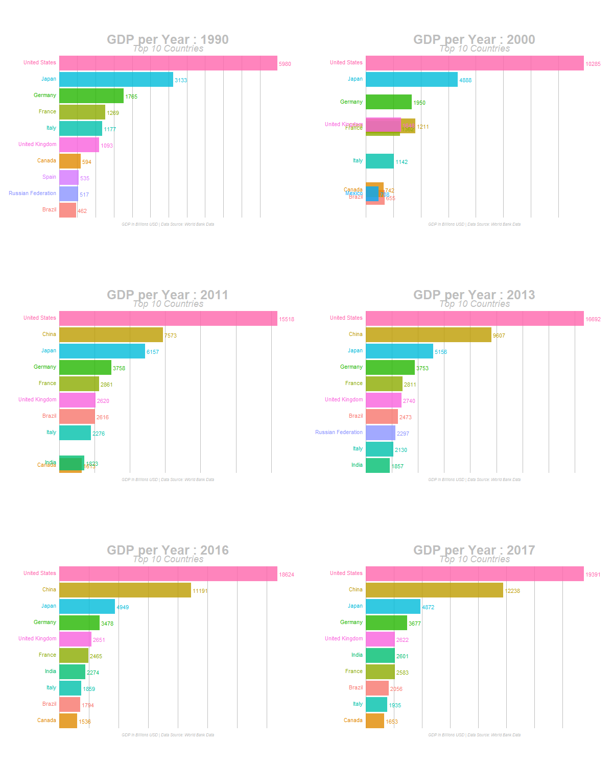
Dynamic Bar Chart using gganimate
